Development of mobile first projects is the latest buzz word in the world of designing. The most popular frameworks for this technique are unquestionably Bootstrap with its successor Less Design Framework. These design frameworks make front end web development very fast and cater to a variety of devices with ease and comfort.
Be it Android powered phones or tablets or the iOS devices like the iPhones or the iPads or even the Windows Phone Series; when it comes to responsive and adaptive mobile first projects; Less Framework comes across as a dependable framework based on HTML, CSS and JS. It is compatible with all the well known browsers like IE 9, Safari, Google Chrome, Firefox and Opera. Both Less Framework and Bootstrap are licensed under the MIT license and available at GitHub as an open-source. They share the common purpose of enabling mobile apps and websites to become cross-platform and cross-device.
Less - How it Works
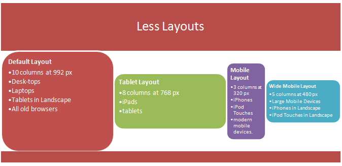
Less frame work uses static width and media-queries to switch between different designs for different popular screen resolutions. It consists of 4 layouts and 3 typography sets based on a single grid. The CSS grid framework modifies the designs of the websites and mobile apps into adaptive and queries code the Child and the Dependent Layouts. Child layouts are obviously controlled by device size and browsers.

Less is a CSS pre-processor, extending the CSS language by allowing variables, mixins, functions and other objects making it more maintainable and scalable. Less runs inside Node, in the browser with compatibility with third party tools for compilation.
Less Framework more than achieves its task of building efficient websites with consistent layouts. The single grid base gives the layouts a similar look and feel where the elements can be reused and fitted easily across the layouts. Less sticks to simple HTML and CSS coding. It makes the development and design simple for all browsers and various devices.
Be it Android powered phones or tablets or the iOS devices like the iPhones or the iPads or even the Windows Phone Series; when it comes to responsive and adaptive mobile first projects; Less Framework comes across as a dependable framework based on HTML, CSS and JS. It is compatible with all the well known browsers like IE 9, Safari, Google Chrome, Firefox and Opera. Both Less Framework and Bootstrap are licensed under the MIT license and available at GitHub as an open-source. They share the common purpose of enabling mobile apps and websites to become cross-platform and cross-device.
Less - How it Works
Less frame work uses static width and media-queries to switch between different designs for different popular screen resolutions. It consists of 4 layouts and 3 typography sets based on a single grid. The CSS grid framework modifies the designs of the websites and mobile apps into adaptive and queries code the Child and the Dependent Layouts. Child layouts are obviously controlled by device size and browsers.

Less is a CSS pre-processor, extending the CSS language by allowing variables, mixins, functions and other objects making it more maintainable and scalable. Less runs inside Node, in the browser with compatibility with third party tools for compilation.
Less Framework more than achieves its task of building efficient websites with consistent layouts. The single grid base gives the layouts a similar look and feel where the elements can be reused and fitted easily across the layouts. Less sticks to simple HTML and CSS coding. It makes the development and design simple for all browsers and various devices.


Post a Comment